Tag: altprocess

Uncategorized

Joe

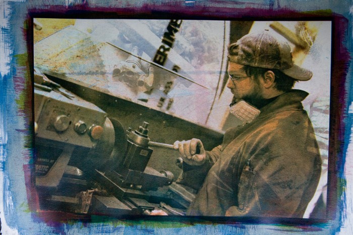
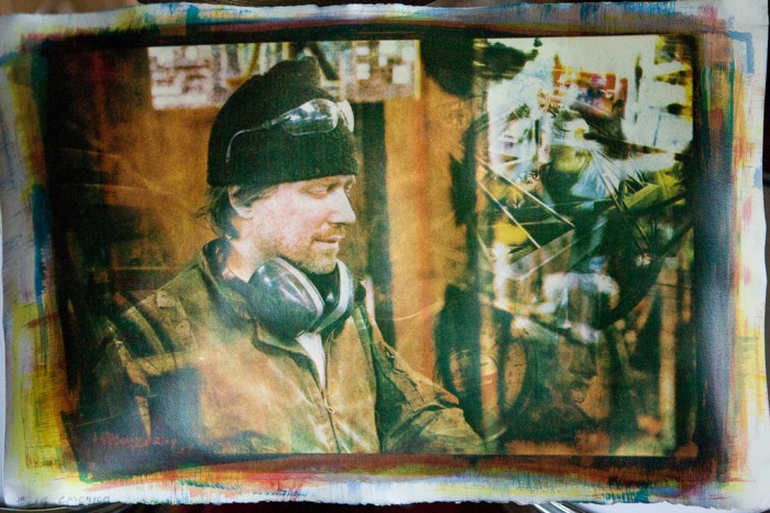
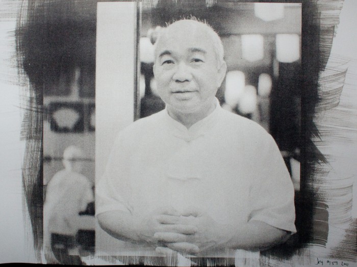
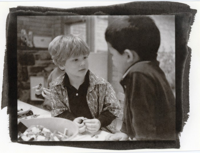
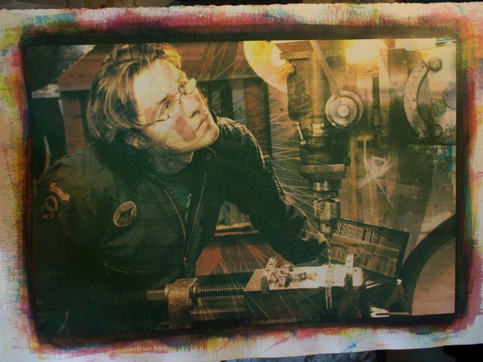
Continuing in the “Frank’s Kitchens” series: 9 layers of gum, featuring Joe hard at work. I think I may print another layer here; I’m not quite satisfied with the color balance at the moment (which is kinda funny, because I’m color blind). Aah, the trouble with gum prints; I never know when I’m done 🙂

The paper is Stonehenge Warm White.

Uncategorized

John

Gum over cyanotype on a half sheet of Stonehenge Rising warm white paper.

This print is a direct result of a morning of failures last week. My cyan pigment wouldn’t stay on the paper – a combination of two different problems related to two variables I changed simultaneously. After three poor prints I decided I would forego the cyan for the morning and use cyanotype for the base layer to get me started.

I miscalculated the amount of cyanotype solution I needed (resulting in the …[more]

Uncategorized

MonkE

This is probably my busiest art-related year ever. A number of things have fallen in to place, all at the same time. I’m a little saddened that it’s taken me further away from posting regularly, but on the other hand, it means that I have work like this that I can post when I have the chance.

Meet Monk E. Burnswell, of Frank’s Kitchens. I’ve accidentally found myself working with these great folks, as part of one of my “I want to do this so …[more]

Uncategorized

Sheila and Bob

Hot off the heels of my glass-on-casein in the annual juried Phillips’ Mill exhibition, I’m looking at my next set of research: fumed silica.

This piece is a gold-toned kallitype, printed on Herschel (a handmade linen paper) pre-treated with fumed silica. The pretreatment generally deepens the blacks, with some other more subtle differences in contrast and overall response. I’ve been slowly pulling together a project to more scientifically test different kinds of fumed silica with dif …[more]

Uncategorized

Burlesque Nr. 5

I’m FINALLY returning to the Burlesque shots from Jim Thorpe’s burlesque festival last year. Between my last post on this subject and now, I’ve been more or less focused on casein-on-glass for some shows this spring, and that’s mostly out of the way now (just have to deal with some paperwork and delivery, but the prints are done).

This was originally shot on a Canon 5D, ISO 3200, with a 70-200 f/2.8L. I reduced it to B&W and printed this kallitype on Herschel paper (a handmade paper f …[more]

Uncategorized

Meta Workroom

Spent quite a lot of yesterday printing bigger than I’ve done before – getting up to the maximum sizes I can manage with my vacuum frame and light box. This is a 10×15 print on a half-sheet of Herschel, a wonderful handmade siderotype-friendly paper from Ruscombe Mill. It’s far and away my favorite kallitype paper, and this palladium-toned kallitype shows it well. To get this kind of black density on other papers I have to use multiple coats and/or multiple hits.

I had expected to cro …[more]

Uncategorized

Joe

Originally shot on Delta 3200 in a Diacord G; developed in Microphen. This is a palladium-toned kallitype. I’m reasonably happy that it came out (yay, my chemistry survived the flooding) but not so thrilled with the density; this is my first kallitype on Fabriano Artistico HP 300 and I’m not sure if the paper or my technique lead to this thinner-than-usual print. I’m hoping to preshrink some FabArt and try a double-hit kallitype on it.

Regardless: as you might gather from the title, t …[more]

Uncategorized

Brooke

As with the other prints I’ve posted, this doesn’t really translate to digital very well; everything I’ve done to try to bring these online leaves the images somewhat washed out and thin-looking. Perhaps someday I’ll have a breakthrough and re-post all of these.

Brooke, owner of Dragontown Corsets in Jim Thorpe, PA. This was, I believe, from the 2007 St. Patty’s parade.

5 layers of 3/16″ glass, for a total of 9 printings (double-printed most of the layers). I think I only woun …[more]

Uncategorized

Pipers

From 2009’s Jim Thorpe St. Patty’s parade, originally shot on a Canon 5D.

This is a 6-layer casein-on-glass print; two layers of each magenta, cyan, and yellow. Visually, I’m happy with it. But it doesn’t fit well in the frames that I like, so I’ll probably double-up the printing of the magenta and yellow layers. I want to leave the cyan as two distinct layers, which helps the tartan over this man’s shoulder (upper-right) appear to “float” over the rest of the print.

Uncategorized

She Drank a Little Whiskey

Sheila of the Gilded Cupid B&B in Jim Thorpe, PA surveying the St. Patty’s Day parade route in 2010.

This was originally a digital shot, printed as a casein bichromate on six layers of glass – about 30 hours of work, including the dozens of layers that I printed and discarded. The final print is just over half an inch thick.

During the process of making this print, I’ve cataloged about 20 different variables that are affecting the prin …[more]

Uncategorized

Marching Ever Onward

Happy Father’s Day! I got three awesome presents today.

First, a bowl of radishes from our garden. Yummy, but photographically uninteresting.

Second, some sodium citrate and tartaric acid. Yay more kallitypes!

Third, the first hints of success with the process that I’ve been trying to get a hold on for something like 7 months now.

This shot is a reasonable but somewhat untrue representation of a shot through my first monstrosity: a 10×12″ casein print on glass. …[more]

Uncategorized

Nate the Builder

Shot on Delta 3200 in a Mamiya 7, developed in Perceptol. Printed on Arches Aquarelle hot pressed 140# as a kallitype and toned with palladium.

From his fifth birthday, our good friend Nate.

Note that this is Nate building with Legos. Not to be confused with Nate’s other roles as truck driver, rock star, superhero, trampoline artist, and so on.

Uncategorized

Burlesque Nr. 4

Originally a digital shot, this kallitype (on Stonehenge 11×14) is toned with palladium. I suspect that the “pure” table salt that I used in making the toner is not actually pure. I expected this to darken and head more toward gray, and instead it gained some slight density and went to this light brown-ish color. Still, quite a pleasant print. And reason for me to place another order with Bostick & Sullivan as I’m also nearly out of silver nitrate …[more]

Uncategorized

Burlesque Nr. 3

Mamiya 7, HP5, Microphen, EI around 35000.

Yes, another 50-ish minute developing effort – then printed as a gold-toned kallitype. The print picked up more density during the toning than I expected. In the untoned print (a beautiful warm chocolate-brown) her legs had very little definition and very high contrast. About 8.5 minutes in a gold chloride toning solution just before fixing and the warm browns all turned in to cold grays, with more density and reduced contrast.

This p …[more]

Uncategorized

Burlesque Nr. 2

I love it when things just work.

From the Jim Thorpe Burlesque Festival: the negative comes from 4 rolls of HP5+, under-exposed at least 3 stops at the Mamiya’s metered 3200 (which I find to already under-expose a touch). I optimistically developed the first roll at 6400 in Microphen (finding it very thin), and then the other 3 rolls at an approximate ISO 35000 – 40 minutes, based on the response curve I’ve calculated from repeated development work with this film and developer. All of …[more]

Uncategorized

Burlesque Nr. 1

From the Jim Thorpe Burlesque Festival a few weeks back. I’ve been working on various print techniques this year, one of them being these Kallitypes. It’s been quite a learning experience (my background is in engineering, not in art) and I’ve finally got repeatable results.

This is an un-toned kallitype print on Arches hot pressed 140#, developed in a mix of sodium acetate and ammonium citrate. Interestingly enough, a second print developed in borax and rochelle salts looks almost ide …[more]

View More