I really like Kallitypes. They’re a simple process. The final prints can take on the characteristics (both visual and chemical) of palladiotypes and platinotypes. And

This is the project that took up most of my 2012. And it’s what I wanted to post about repeatedly during the year, but my
Also taken this spring: gold-toned kallitype on arches HP 140#. Shot with a Mamiya 7, HP5+, developed in Xtol.
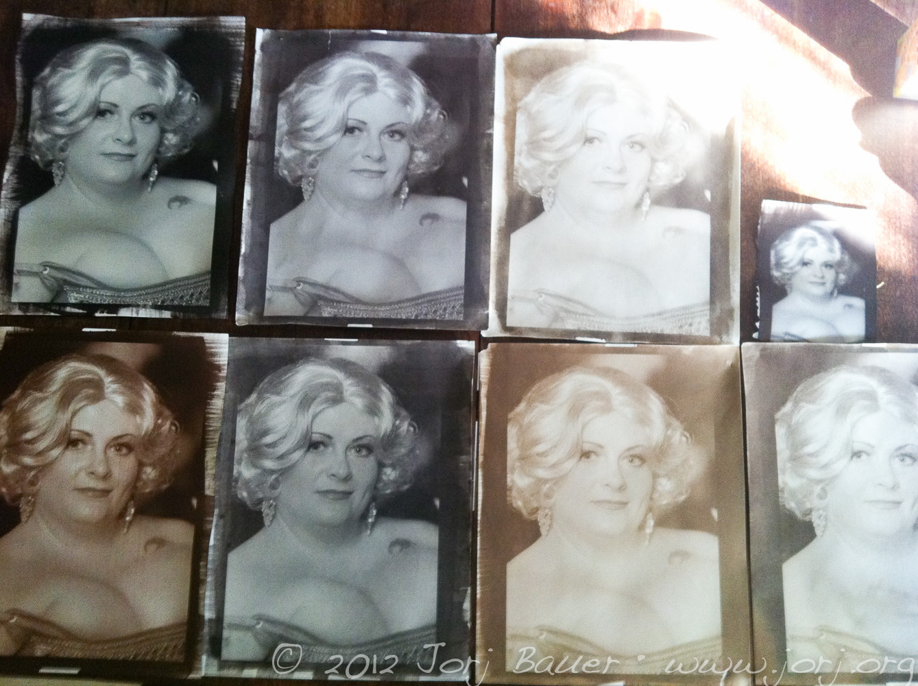
And this is gold toner #2 at the end of its life. Initially, toning happens very quickly – perhaps 3 minutes for the first shot I posted. This shot toned for 15 minutes and, as you can see, took on a more sepia characteristic. This is the same 250mL of toner as the previous two, and I believe this was the fourth reuse of that toner. All three of these are 11×14.
I …[more]
Uncategorized
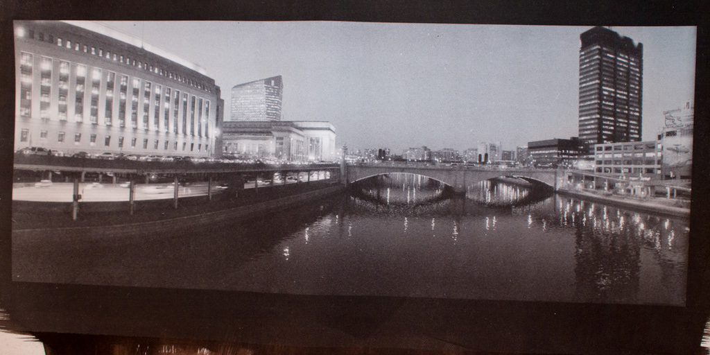
Taken this spring; Philadelphia, looking north from the Chestnut St. bridge. Gold toned kallitype on Arches HP 140#. Shot with a Widelux FV and Delta 3200, developed with Perceptol.
This gold toning is about the third reuse of 250mL of gold toner #2, toned with the same batch of toner as yesterday’s print. Development was identical between the two. The color has shifted slightly warmer and is still very effective at both preserving the print (replacing silver with gold) and changing …[more]
Uncategorized
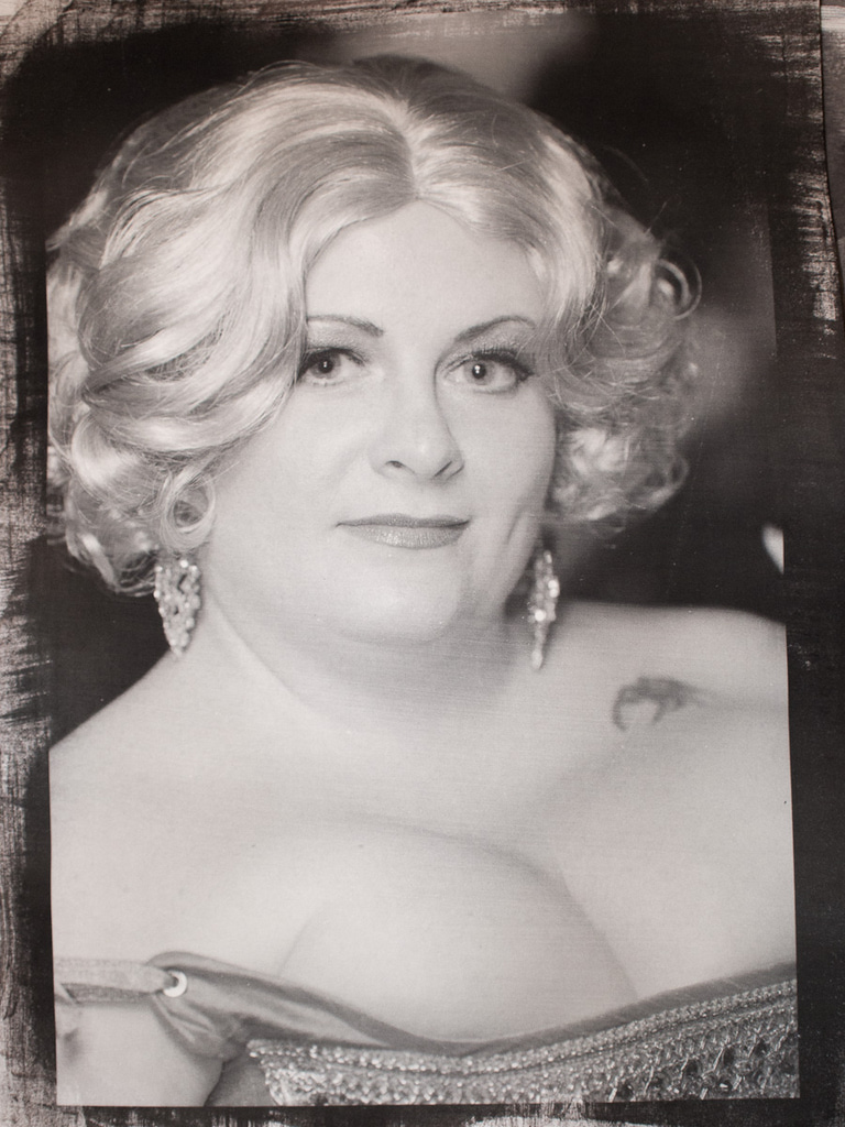
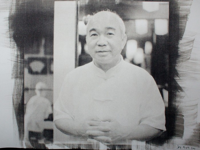
From this year’s Kensington Kinetic Sculpture Derby: Erik and Hedy of Frank’s Kitchens. Gold-toned kallitype on Arches 140# HP.
Another aspect of my experimentation during PrintFest was control over the toning characteristics of reused gold toner. Straight gold toner (gold chloride and citric acid) form a good, but not great, toner that can tone prints purple if used in sufficient concentration. Lower concentrations tend toward a cold black. But the toner has a short shelf life once …[more]
Uncategorized
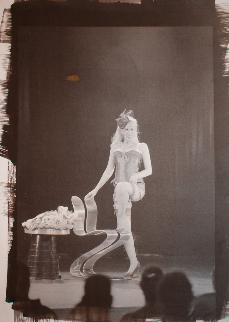
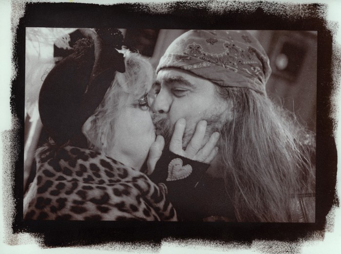
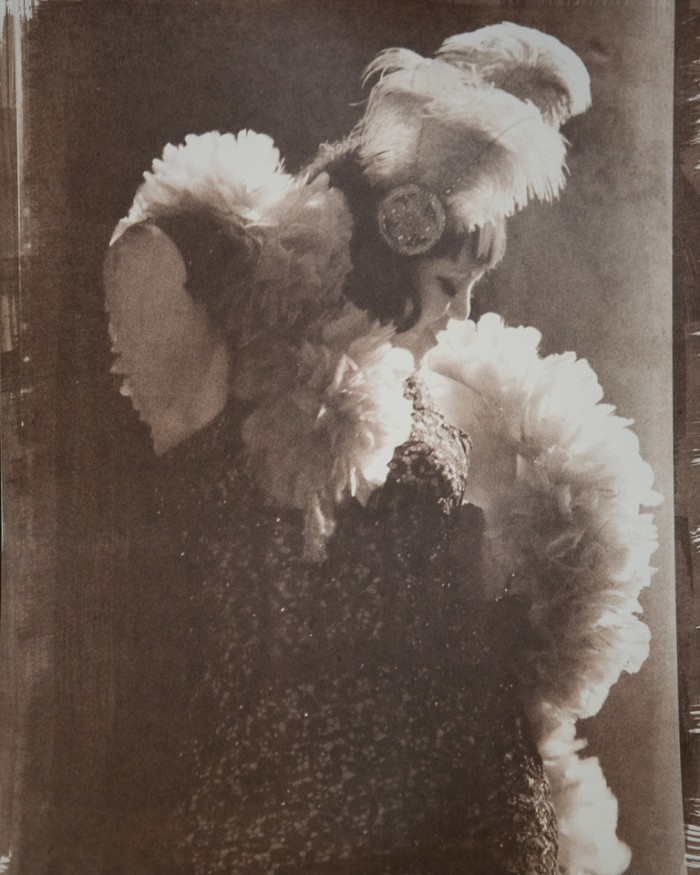
From the PA Burlesque Festival on June 30th: Francean Fanny. Selenium toned kallitype on Arches 140# HP.
I have no idea what the dot is; something got on the paper that didn’t belong there. I actually like this print cropped as a square and expect that if I frame it I’ll just crop that part out. But as a learning piece from my week-long PrintFest: no streaking from fumed silica; successful selenium toning without substantial staining. This is …[more]
Uncategorized
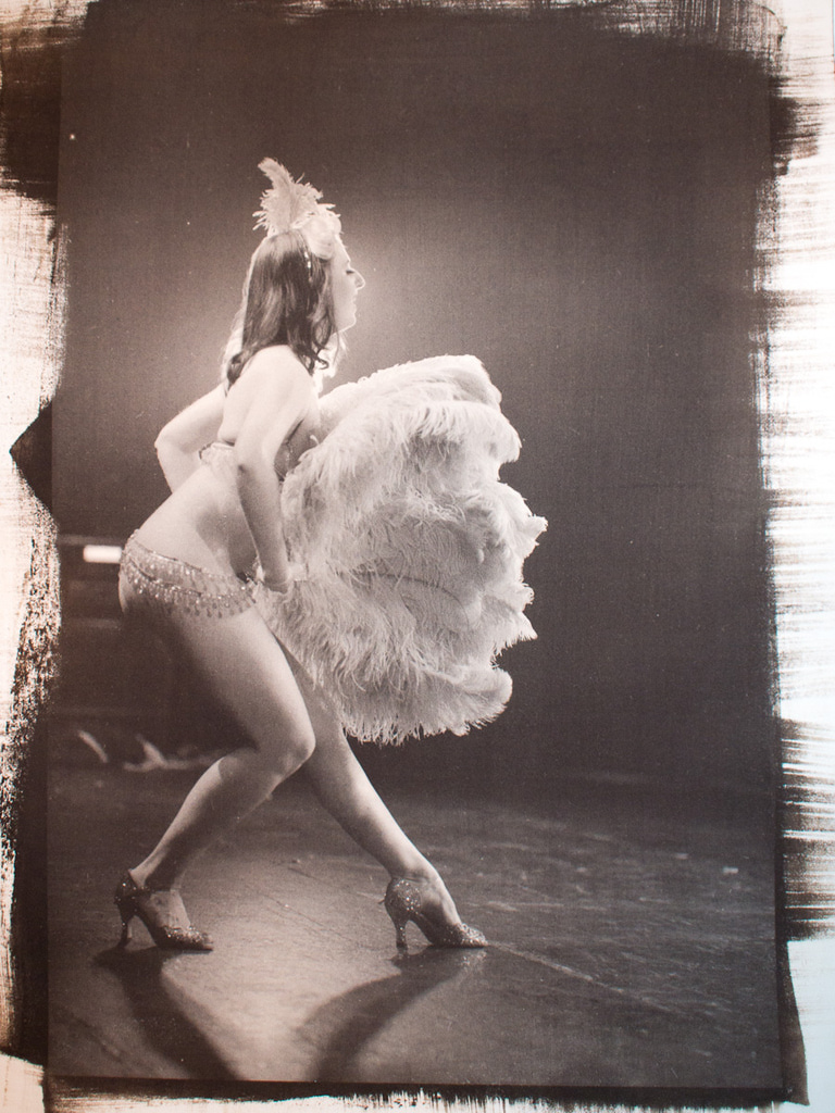
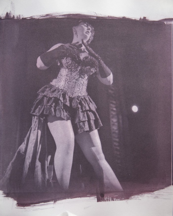
From the PA Burlesque Festival, June 30th: Donna Touch. Selenium-toned kallitype on Arches 140# HP.
Continuing down the selenium road: this is about 20 minutes of selenium toning, after having pre-fixed for 2 minutes. It’s a touch more brown than I wanted, but it’s in the ballpark.
There’s also some slight streaking evident in the print once you get up close to it. Each of these sheets of paper were coated with fumed silica (Aerosil 380, to …[more]
Uncategorized
John, of Frank’s Kitchens. Selenium toned kallitype on Arches HP 140#.
I’m understanding selenium toning a little better as a result of this week’s PrintFest. Selenium and Kallitypes don’t get along very well generally. And now I understand why.
The sensitizer for kallitypes is Ferric Oxalate and Silver Nitrate. Usually, conversations about failures with kallitypes center around the ferric iron being reduced to ferrous iron from exposure to UV light – but with selenium ton …[more]
Uncategorized
It’s only Wednesday, but I’m already exhausted! I’ve been printing all day every day this week: 8 hours on Monday, 7 Tuesday, and 10 today.
Monday was about experimentation: trying to improve the quality of my kallitypes on Stonehenge paper (trying to reduce my cost per print, since my preferred paper is handmade and imported from France); using fumed silica; working with different developers; experimenting with selenium toner for kallitypes. No good prints came of it. The prints got …[more]
Hot off the heels of my glass-on-casein in the annual juried Phillips’ Mill exhibition, I’m looking at my next set of research: fumed silica.
This piece is a gold-toned kallitype, printed on Herschel (a handmade linen paper) pre-treated with fumed silica. The pretreatment generally deepens the blacks, with some other more subtle differences in contrast and overall response. I’ve been slowly pulling together a project to more scientifically test different kinds of fumed silica with dif …[more]
Uncategorized
I’m FINALLY returning to the Burlesque shots from Jim Thorpe’s burlesque festival last year. Between my last post on this subject and now, I’ve been more or less focused on casein-on-glass for some shows this spring, and that’s mostly out of the way now (just have to deal with some paperwork and delivery, but the prints are done).
This was originally shot on a Canon 5D, ISO 3200, with a 70-200 f/2.8L. I reduced it to B&W and printed this kallitype on Herschel paper (a handmade paper f …[more]
Uncategorized
Spent quite a lot of yesterday printing bigger than I’ve done before – getting up to the maximum sizes I can manage with my vacuum frame and light box. This is a 10×15 print on a half-sheet of Herschel, a wonderful handmade siderotype-friendly paper from Ruscombe Mill. It’s far and away my favorite kallitype paper, and this palladium-toned kallitype shows it well. To get this kind of black density on other papers I have to use multiple coats and/or multiple hits.
I had expected to cro …[more]
Uncategorized
Originally shot on Delta 3200 in a Diacord G; developed in Microphen. This is a palladium-toned kallitype. I’m reasonably happy that it came out (yay, my chemistry survived the flooding) but not so thrilled with the density; this is my first kallitype on Fabriano Artistico HP 300 and I’m not sure if the paper or my technique lead to this thinner-than-usual print. I’m hoping to preshrink some FabArt and try a double-hit kallitype on it.
Regardless: as you might gather from the title, t …[more]
Uncategorized
Shot on Delta 3200 in a Mamiya 7, developed in Perceptol. Printed on Arches Aquarelle hot pressed 140# as a kallitype and toned with palladium.
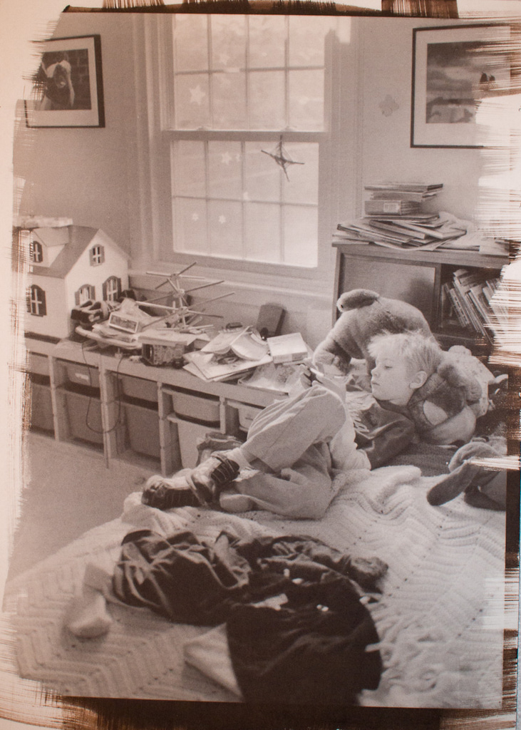
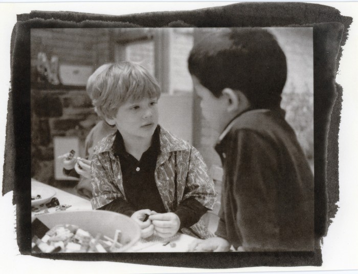
From his fifth birthday, our good friend Nate.
Note that this is Nate building with Legos. Not to be confused with Nate’s other roles as truck driver, rock star, superhero, trampoline artist, and so on.
Uncategorized
Originally a digital shot, this kallitype (on Stonehenge 11×14) is toned with palladium. I suspect that the “pure” table salt that I used in making the toner is not actually pure. I expected this to darken and head more toward gray, and instead it gained some slight density and went to this light brown-ish color. Still, quite a pleasant print. And reason for me to place another order with Bostick & Sullivan as I’m also nearly out of silver nitrate …[more]
Uncategorized
Mamiya 7, HP5, Microphen, EI around 35000.
Yes, another 50-ish minute developing effort – then printed as a gold-toned kallitype. The print picked up more density during the toning than I expected. In the untoned print (a beautiful warm chocolate-brown) her legs had very little definition and very high contrast. About 8.5 minutes in a gold chloride toning solution just before fixing and the warm browns all turned in to cold grays, with more density and reduced contrast.
This p …[more]
View More