5 ways to improve your Kallitypes

I really like Kallitypes. They’re a simple process. The final prints can take on the characteristics (both visual and chemical) of palladiotypes and platinotypes. And because you start with iron and silver, you have the opportunity to examine the print before deciding that you want to invest other precious metals (gold, palladium or platinum) in the final print.
Here are a few of the important lessons I’ve learned over my two years of researching and performing this process.
Choose a good paper.
Some papers just aren’t good for siderotypes (prints that begin with iron, such as Kallitypes, cyanotypes, and platinotypes). Often the internal sizing (from the manufacturer) will interfere with the chemical process. Sometimes you’ll buy a new batch of paper that’s worked before, and it just doesn’t work any longer; manufacturers occasionally change their production processes and wind up including modern compounds which will interfere with siderotype chemistry.
So, if you’re having bad results, try a different paper! My personal favorite is Ruscombe Mill’s Herschel or Buxton. They’re both quite expensive (because they’re both handmade, and then imported to the US) but they’re manufactured specifically for siderotypes, and have a great texture. Money well invested.
Prepare the paper with fumed silica.
This is an emerging technique for siderotypes: using a high-density foam paint roller to apply hydrophilic fumed silica to the paper before brushing on the sensitizer. There’s a lot of research to be done here, but the blacks are indeed deeper when doing this.
One tip: be wary ordering fumed silica via Amazon. I did, and one seller sold me what they promised was hydrophilic [attracts water] but in reality it was hydrophobic [repels water] and is worthless for this process.
Tone your prints.
Toning with gold, palladium, platinum or – in some cases – selenium will improve the print dramatically. This helps clear the print, remove solarization, and improve the archival quality of the print. And if you tone with palladium or platinum, you should wind up with a print that’s chemically identical to a palladiotype or platinotype.
Print two copies at once.
Yes, this is the same advice that I give for improving your gum prints. And for substantially the same reason. With Kallitypes, you can experiment with multiple toners (some act on highlights or shadows first, enabling split toning) or different developers (I have four different kallitype developers that produce different colors). Since all of that is post-exposure, having two prints that were exposed from the same batch of sensitizer in the same way lets you see exactly what differences you’re getting from any A vs. B comparison.
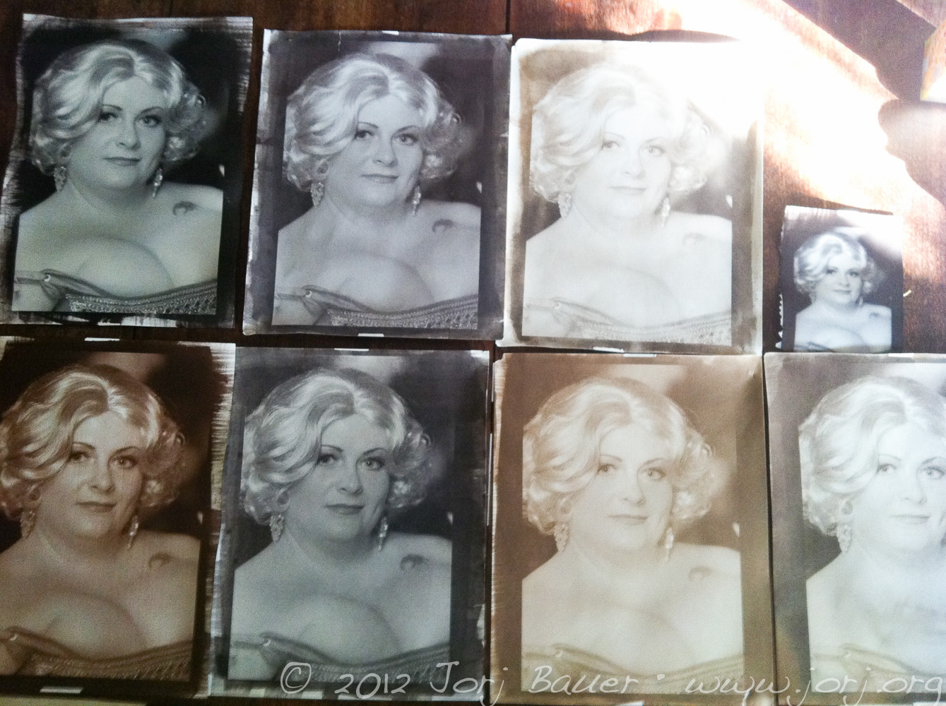
In the image above, there are 8 different prints I made of the same negative and exposure time (well, 7 with the same negative; the small one was a test of the negative, exposure and chemistry before I started). These have different fumed silica treatments and tonings, but all used the same developer.
Filter your developer after using it.
Kallitype developers, much like platinotype developers, last nearly forever. But while developing, solid iron compounds will form in the developer. These are undesirable (i.e. “will stain future prints” turning the paper a rust-like color, and probably lead to iron eating away at the image over time). They’re easy enough to filter out; I happen to use a Buechener funnel, which uses suction to filter faster, but that complication isn’t really necessary. A simple coffee filter and funnel should do just as well.
If you’re really dying to get in to the details of Kallitypes, see if you can find a copy of the (out of print) book Making Kallitypes: A Definitive Guide by Dick Stevens. It’s not a thrilling read but it’s full of details of Stevens’ own experiments with this process.